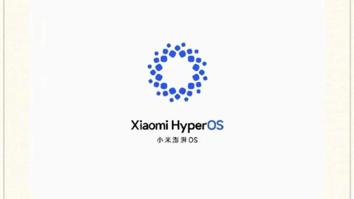
Xiaomi’s Android-based MIUI is giving way to the more expansive HyperOS on the company’s smartphones and tablets. This strategic move by the tech giant, known for its involvement in diverse markets, including electric vehicles, is aimed at establishing its own ecosystem similar to Apple. A recent Weibo post has unveiled Xiaomi’s freshly designed logo for HyperOS, marking a significant development.

The newly revealed HyperOS logo reflects Xiaomi’s anticipation and commitment to innovation. Characterized by a minimalist design, the logo’s round shape subtly emphasizes the ecosystem and comprehensiveness that HyperOS aims to deliver.
In comparison to the previous MIUI logos, this unveiling represents a notable step forward. Xiaomi has transitioned from a letter-based logo to a more visually appealing design. While the former may have been practical for version distinction, the new approach signifies a departure toward a more sophisticated and contemporary aesthetic.
As Xiaomi gears up for the launch of its inaugural electric vehicle, the excitement surrounding HyperOS is palpable. The unveiling of the new logo adds a layer of anticipation, prompting users to ponder whether this design will evolve with different versions. The evolution from MIUI to HyperOS signifies not just a software upgrade but a deliberate stride toward a more cohesive and visually appealing user experience. The future of Xiaomi’s ecosystem, marked by this new logo, holds the promise of innovation and user-centric design.


