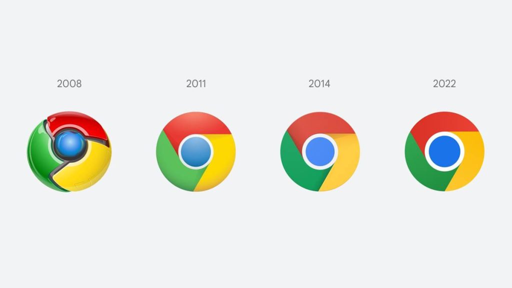
Google Chrome has finally gotten a refreshed icon after eight years with an even more simplified design to align with Google’s “more modern brand expression,” a designer for the browser revealed on Friday. The company has already started to roll out the new icon to users across all devices.

The color scheme remains the same, with red, blue, green, and yellow as the primary colors, however, the saturation has been upped a little, while shadows have been ditched completely with the new Google Chrome icon, making it appear more lively.
Some of you might have noticed a new icon in Chrome’s Canary update today. Yes! we’re refreshing Chrome’s brand icons for the first time in 8 years. The new icons will start to appear across your devices soon. pic.twitter.com/aaaRRzFLI1
— Elvin 🌈 (@elvin_not_11) February 4, 2022
Furthermore, the new Google Chrome icon has been tweaked specifically for each operating system as the company wanted to make the icons feel “recognizably Chrome.” The icon gains a subtle gradient on Windows, while a more 3D look has been crafted for macOS, and an extremely flat design with brighter colors has been introduced for the Chrome OS.
However, the Google Chrome icon has gotten additional changes on macOS, with a colorful ribbon being added for the Beta and Dev versions of the browser. The new icons will start showing up across devices soon as the company has already started the rollout of the new update.
Read more: Google One Adds VPN For iOS with Premium Plan.
Follow INCPAK on Facebook / Twitter / Instagram for updates.


