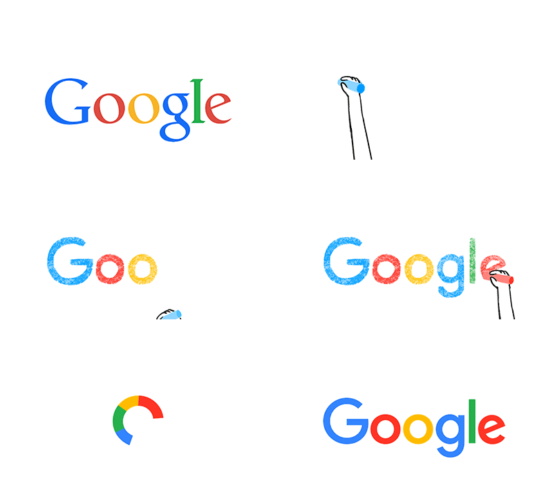
Google is introduced a new logo today. Just a month after unveiling a major restructuring of the company, Google is updating its image, too. The new Google logo is still a wordmark, but it’s now using a sans-serif typeface, making it look a lot more modern and playful. The colors are also softer than they used to be. The logo bears a bit more resemblance to the logo of Google’s new parent company, Alphabet, as well. Alphabet’s wordmark has a similarly unadorned look, and this update makes the two companies’ design language fall more inline.
As Google’s video introducing the new logo notes, the wordmark has been evolving ever since it was created in 1998. But this is easily its biggest change since 1999, when Google first cleaned up the lettering and settled on its four colors. Since then, the logo has just been flattened out more and more, with today’s update representing a huge leap. In addition to changing up the wordmark, Google is also changing the tiny “g” logo that you see on browser tabs. It’s now going to be an uppercase “G” that’s striped in all four of Google’s colors. Google says that the new design will be rolling out across all of its products soon — in fact, it’s already on Google’s homepage, with a cute animation that wipes away the old logo and draws in the new one.

In a blog post, the company offered: “You expect Google to help you whenever and wherever you need it, whether it’s on your mobile phone, TV, watch, the dashboard in your car, and yes, even a desktop!”
Yes! Even on a desktop!
Ergo: “Today we’re introducing a new logo and identity family that reflects this reality and shows you when the Google magic is working for you, even on the tiniest screens.”
I don’t know about you, but I’ve always thought that Google’s magic has been working for me all the time.
It works to tell me what I need to know. It works to read my e-mails, so that it can “improve” the advertising to which I’m subjected. It follows me from the moment I wake up to the time I slump back into bed. Does it take some new icons to tell me this?
Yes! It does!
In Google’s words: The new look “doesn’t simply tell you that you’re using Google, but also shows you how Google is working for you. For example, new elements like a colorful Google mic help you identify and interact with Google whether you’re talking, tapping or typing.”
I know when I’m interacting with Google already. What I’m less sure of is when Google is interacting with me. I find myself occasionally looking over my shoulder wondering if Google is behind me. I worry that when I shout at my laptop or even my TV, Google might be listening to me. I also sometimes get a strange feeling beneath the table when I’m out to dinner. Will a little icon warn me about that too?
At heart what does this new logo represent? The deeply cynical might suggest that it’s a small, appeasing feel-good element for those who now work for mere Google as opposed to the slightly sexier Alphabet.
It’s certainly a pleasant, cheery touch-up to a logo that was beginning to feel more than a touch dated. Companies go through these cycles, like a middle-aged man updating his Levi’s or buying a shinier Ford truck.
Google’s interpretations of this logo, though, are magical — in the sense of culled from a fine children’s book.
The comments on Google’s blog post have run into the thousands. Many are complimentary. They tend to simply say whether they like it or not, which is exactly as it should be. Does it evoke a warm feeling? Does it feel a touch renewed?
Then there’s Christopher Lira: “Meh, I’ll be impressed when y’all finally change it to Skynet and become self aware.”
Design, just like magic, doesn’t impress everyone.


