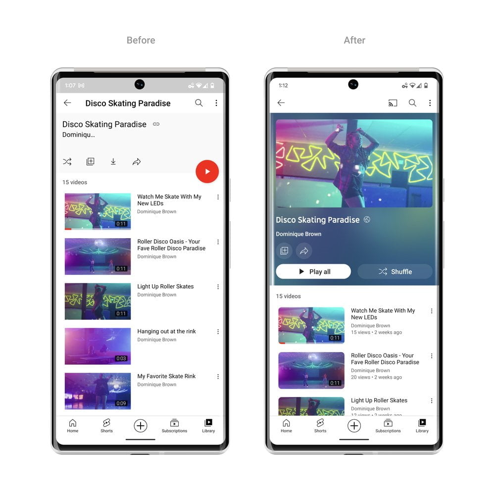
YouTube has introduced some design changes and several new features to the streaming platform that offer a more modern and immersive viewing experience while also improving how users watch videos. According to YouTube’s blog, the company has decided to roll out a darker theme and an ambient design after several months of testing and users’ feedback.

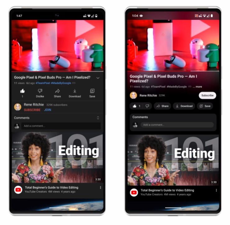
YouTube has overhauled the dark theme to become even darker so the colors truly pop on your screen and the update is being rolled out on the web, mobile, and smart TVs.

Meanwhile, the company has added a new feature called ‘ambient mode’ that uses dynamic color sampling to introduce a subtle effect so that app’s background color adapts to match the video being played on the app.

Furthermore, YouTube has made changes to make improvements to their video player so there are less distractions while playing a video. “YouTube links in video descriptions will change to buttons, and frequent actions such as like, share and download, are now formatted to minimize distraction.” the company said.
The subscribe button is also getting a touch up: the new shape and high contrast make it really stand out, and while it’s no longer red, it’s easier to find and way more accessible to everyone on both watch pages and channel pages.
YouTube has also launched ‘pinched to zoom’ feature that will allow users to zoom in and out of a video playing on iOS or Android.
Another feature by the name of ‘precise seeking’ has been rolled out to allow users to go back and forth a video by dragging or swiping while seeking to display a row of thumbnails in the video player and make fine-tuned adjustments to get to the exact part in each video.
Read more: YouTube Introducing Account Handles to Identify Channels.


